


")


Introduction
When creating blog posts in WordPress, layout plays a huge role in how professional and engaging your content looks. Many beginners focus only on writing great content but overlook presentation — and that’s where design can either elevate or weaken your message.
Simply placing an image above or below text often feels basic and visually flat. But when you wrap text around an image, your content instantly looks more structured and intentional — similar to online magazines and professional news websites.
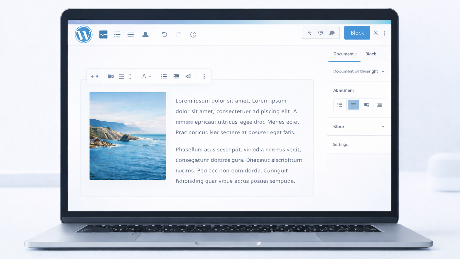
If you’re using the WordPress Block Editor (also known as Gutenberg), you might be wondering how to place text beside an image instead of stacking everything vertically. This is one of the most common layout questions new bloggers ask.
The good news is that WordPress offers multiple built-in ways to create a clean and responsive image layout — without needing advanced coding skills.
In this guide, you’ll learn exactly how to wrap text around an image in WordPress, why it improves readability, and which method works best depending on your content type and layout goals.
What Does “Wrap Text Around an Image” Mean in WordPress?
In simple terms, wrapping text around an image means placing the image on the left or right side of your content while the text flows beside it instead of appearing only above or below it.
Instead of stacking everything vertically, you create a side-by-side layout that feels more balanced and easier to scan.
For example:
❌ Default layout:
Image
Text
Text
Text
✅ Wrapped layout:
Image | Text starts next to it
Image | More text flows alongside
Text continues below once the image ends
In the WordPress Block Editor (Gutenberg), this can be done by adjusting image alignment settings or by using layout blocks like Media & Text or Columns.
Many beginners confuse this with simply adding an image between paragraphs. However, true WordPress image alignment allows text to automatically flow around the image, creating a more dynamic layout that improves visual rhythm.
From a practical standpoint, this technique is especially useful when you want to:
- Place author images beside bio text
- Add product images next to descriptions
- Improve blog post formatting
- Create magazine-style layouts
Highlight key visuals without interrupting reading flow
If you’re trying to figure out how to place text beside an image in WordPress, you’re essentially looking to create this wrapped effect in a way that looks professional and works well across devices.
Quick Summary
- Text flows beside the image instead of stacking below
- Creates a balanced side-by-side layout
- Commonly used in blogs, product pages, and author bios
- Improves visual structure and readability
Why Text Wrapping Improves Blog Design & Readability
Text wrapping isn’t just about design — it directly affects user experience, engagement, and how long readers stay on your page.
When used correctly, it improves both aesthetics and functionality. Improves Reading Flow
1. Improves Reading Flow
Large blocks of text can overwhelm readers, especially on longer blog posts. When you position an image beside the text, it visually breaks the content into digestible sections.
This makes scanning easier, improves readability, and reduces bounce rates — particularly for mobile and tablet users who prefer structured layouts.
In real-world blog design, visual breaks often determine whether a visitor keeps reading or leaves.
2. Creates a Professional Layout
Websites that use responsive image layouts in WordPress look more modern, intentional, and structured. News sites, blogs, and business pages often use text wrapping to maintain visual balance between media and written content.
It signals that the content is thoughtfully designed — not just published.
A clean layout builds subtle trust with readers.
3. Enhances Visual Hierarchy
Images naturally draw attention. When placed beside text rather than above it, they support the content instead of interrupting it.
This improves storytelling, helps guide the reader’s eye, and reinforces important information without breaking the flow.
Good layout design supports your message instead of competing with it, just like customizing your WordPress comment layout improves overall user experience.
4. Supports Responsive Design
When implemented correctly (using proper blocks instead of outdated HTML), wrapped layouts adapt to different screen sizes.
On desktop, content appears side by side.
On smaller screens, WordPress automatically stacks the layout for better usability.
This ensures your content remains readable across devices — which is essential for modern websites.
5. Boosts UX & SEO Signals
Search engines prioritize user experience. When visitors stay longer, scroll further, and interact more with well-formatted content, it can positively influence engagement metrics.
While text wrapping itself does not directly improve rankings, better formatting plays an important role in improving overall WordPress SEO performance by enhancing usability, increasing engagement, and supporting stronger on-page optimization strategies.
In short, wrapping text and images for a better reading experience isn’t just a styling choice — it’s a strategic content design decision that improves both user satisfaction and content presentation.
Key Points
- Breaks large text blocks into readable sections
- Creates a cleaner and more professional layout
- Improves visual hierarchy and content flow
- Enhances mobile readability and responsiveness
- Supports better user engagement signals
4 Ways to Wrap Text Around an Image in WordPress
Now that you understand what text wrapping means and why it improves blog design, let’s move into the practical implementation.
Knowing the concept is helpful — but applying it correctly is what makes your content look professional.
If you’re using the WordPress Block Editor (Gutenberg), there are multiple ways to place text beside an image. Some methods are quick and beginner-friendly, while others offer more control over layout structure and responsive behavior.
Choosing the right method depends on your content type, image size, and design goals.
Below are the four most effective methods to create a responsive image layout in WordPress.
Method 1 – Using Image Alignment (Easy Method)
This is the simplest and fastest way to wrap text around an image in WordPress. It works well when you need a quick layout adjustment without restructuring your entire section.
How to Use Image Alignment:
1. Open your post in the Block Editor.
2. Add an Image block.
3. Upload or select your image.
4. Click on the image.
5. From the toolbar, choose:
- Align Left, or
- Align Right
Once selected, your paragraph text will automatically flow beside the image.
This method uses built-in WordPress image alignment settings to create a basic wrapped effect without adding extra layout blocks or complex styling.
When to Use This Method
- Short blog posts
- Simple layouts
- Author bio sections
- Small images
Quick formatting adjustments
If you’re publishing standard blog content and want a lightweight solution, this method is often sufficient.
Limitations
- Large images can break the layout
- May not look balanced on all screen sizes
- Limited control over spacing
- Less precise column control
Because this method relies on basic alignment, it may not always produce perfectly balanced results — especially on custom themes or narrow content widths.
If you’re looking for a quick solution for how to place text beside an image in WordPress, this is the fastest option. However, it’s best suited for simple use cases rather than advanced layouts.
Quick Recap
- Fastest way to wrap text around an image
- Uses built-in Align Left or Align Right options
- Best for small images and simple layouts
- Limited control over spacing and responsiveness
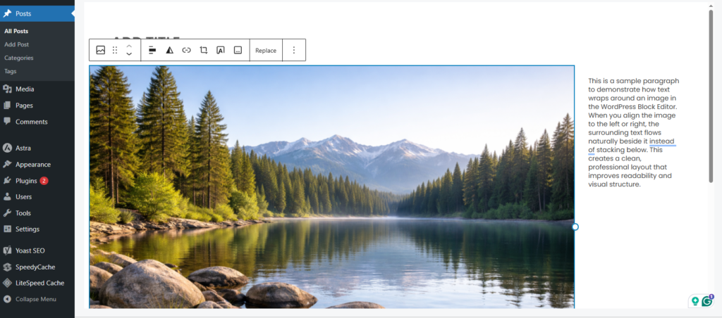
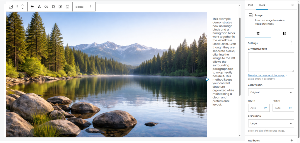
Method 2 – Using Image & Paragraph Blocks
This method gives you slightly more control than simple alignment because you intentionally structure your content using separate blocks.
Instead of relying only on image alignment, you can structure your content manually using:
- An Image block
- A Paragraph block
Place the image first, align it left or right, then immediately add your paragraph block below it.
The text will wrap around the image naturally while keeping the block structure clean and organized.
Why This Works Better
- Cleaner block structure
- Easier to adjust spacing
- Better content organization
- More predictable formatting
From a practical perspective, separating blocks gives you clearer control over where your content begins and ends. This makes future edits easier — especially if you update the image later.
However, this method still depends on alignment settings, so responsiveness may vary depending on your theme’s styling rules.
If your theme supports responsive image layouts in WordPress properly, this method works well for standard blog content and mid-length articles.
Key Points
- Separates image and text into structured blocks
- Offers better spacing control than simple alignment
- Keeps content editing clean and organized
- Responsiveness depends on your WordPress theme
Method 3 – Using Media & Text Block (Best Built-in Option)
If you want a more professional and stable layout, the Media & Text block is the best built-in solution in the WordPress Block Editor.
Unlike simple alignment, this block is specifically designed to align text next to an image in a structured two-column format. It provides more predictable behavior across different screen sizes and themes.
For most users, this is the recommended method because it combines ease of use with responsive control.
How to Add Media & Text Block in Block Editor
- Click the + (Add Block) button.
- Search for Media & Text.
- Insert the block.
- Upload or select your image.
- Add your text in the text area beside it.
WordPress automatically creates a two-column layout with media on one side and content on the other.
This removes guesswork and prevents layout breaking issues that sometimes occur with manual alignment.
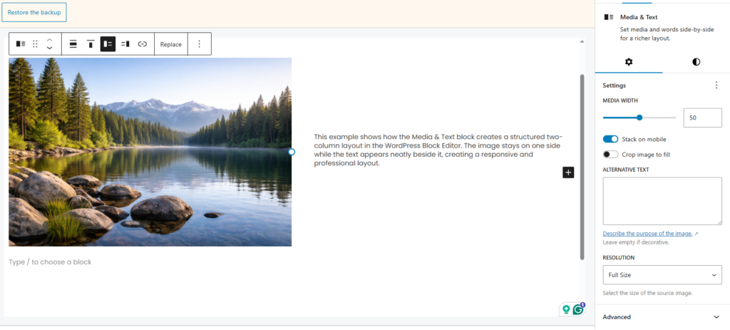
How to Align Text Next to an Image
- Inside the block settings panel, you can:
- Switch image position (left or right)
- Adjust vertical alignment
- Control image width percentage
- Enable stacking on mobile
These options give you controlled flexibility without requiring custom CSS.
This makes it ideal for creating a responsive image layout in WordPress that works smoothly on desktop, tablet, and mobile devices.
From a practical standpoint, if you’re publishing long-form blog posts or professional business content, this method offers the best balance between design quality and simplicity.
Best Choice for Most Users
- Creates a built-in two-column layout automatically
- Fully responsive across desktop and mobile devices
- Offers image position and width control
- No custom CSS required for clean alignment
- Ideal for professional blog and business content
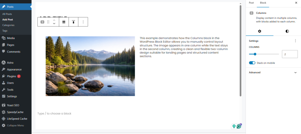
Method 4 – Using Columns Block (Better Layout Control)
If you want full control over layout spacing, column width, and structure, the Columns block is a powerful option.
Unlike Media & Text, which has predefined behavior, Columns give you manual control over each section. This makes it suitable for more advanced layouts where design precision matters.
How to Use the Columns Block
- Add a Columns block.
- Choose a two-column layout.
- Insert an Image block in one column.
- Insert a Paragraph block in the other column.
You can then adjust each column’s width, spacing, and alignment separately.
This method gives you more flexibility than Media & Text and allows greater customization.
When to Use Columns
- Landing pages
- Product descriptions
- Service pages
- Custom blog layouts
- Feature comparison sections
Because you manually control each column, this method works well for advanced responsive design setups and structured content layouts.
However, it does require slightly more attention to spacing and mobile preview testing.
If you need maximum design flexibility, Columns is the better choice.
If you want speed and simplicity, Media & Text remains the safer option.
Flexible Layout Option
- Provides full control over column structure
- Allows custom width and spacing adjustments
- Ideal for landing pages and service sections
- Requires manual mobile preview testing
- Best for advanced or structured layouts
CSS Method for Advanced Users
If you want complete control over how text wraps around images in WordPress, using custom CSS is the most flexible solution.
While the Block Editor provides built-in layout options, advanced users often prefer CSS for more precise spacing, float behavior, alignment control, and responsive customization.
This method gives you full styling authority — which is especially useful when you need consistent design across multiple posts or custom templates.
This method is especially useful if:
- Your theme overrides block styling
- Text wrapping is not working properly
- You want custom spacing or margins
- You’re building a custom WordPress layout
- You need pixel-level layout control
From a practical standpoint, developers and experienced site owners often rely on CSS when built-in blocks don’t provide enough flexibility.
Basic CSS Example Using Float
.wrap-left {
  float: left;
  margin: 0 20px 20px 0;
}

.wrap-right {
  float: right;
  margin: 0 0 20px 20px;
}
This code pushes the image to one side while allowing the surrounding text to flow naturally beside it.
The margin values create spacing between the image and text so the layout doesn’t look cramped.
Then, in your WordPress editor:
- Add an Image block.
2. Open Advanced settings in the block sidebar.
3. Add a CSS class:
- wrap-left
- or wrap-right
Now your text will flow naturally beside the image using your custom styling rules.
This approach works consistently across posts once the CSS is added to your theme’s Additional CSS section.
Making It Responsive
To ensure a responsive image layout in WordPress, you should add a media query:
@media (max-width: 768px) {
  .wrap-left,
  .wrap-right {
    float: none;
    margin: 0 0 20px 0;
    display: block;
  }
}
This ensures that on smaller screens, the float is removed and the image stacks above the text instead of squeezing the layout.
When to Use CSS Instead of Blocks
Use CSS wrapping when:
- You need pixel-perfect control
- You’re building a custom theme
- You want consistent styling across multiple posts
- The default WordPress image alignment is not behaving properly
- You need advanced spacing or layout overrides
However, for most beginners, built-in blocks are safer and easier to manage. They reduce the risk of layout conflicts and automatically handle responsive behavior.
If you’re not comfortable editing CSS, it’s usually better to stick with Media & Text or Columns blocks.
Common Mistakes to Avoid
Even though wrapping text around images seems simple, many users unintentionally break their layout. Most issues happen because of sizing, spacing, or responsiveness mistakes.
1. Using Oversized Images
Below are the most common mistakes to avoid.
Large images can push text too far down or break the layout completely — especially in narrow content areas.
✔ Always resize images properly
✔ Use appropriate image dimensions (especially when choosing the correct featured image dimensions in WordPress)
✔ Avoid full-width images for wrapped layouts
✔ Optimize images for web performance
Oversized visuals reduce readability, affect page speed, and negatively impact overall design balance.
A good rule of thumb: wrapped images should support content, not dominate it.
2. Ignoring Mobile Preview
Many users check the layout only on desktop.
But text wrapping behaves very differently on smaller screens.
✔ Always preview in mobile view
✔ Use responsive blocks like Media & Text or Columns
✔ Add media queries if using custom styling
✔ Test spacing on real devices when possible
A layout that looks perfect on a desktop can appear cramped or broken on smartphones if not tested properly.
Mobile readability is critical for user experience and overall engagement.
3. Overusing Text Wrapping
Not every image needs text beside it.
- Make content feel crowded
- Reduce readability
- Distracted from key points
- Break the visual rhythm
Too many wrapped images can:
- Feature images inside content
- Product descriptions
- Author sections
Use wrapping strategically — especially for feature highlights, author sections, product descriptions, or key visuals.
White space is just as important as content.
4. Not Adjusting Spacing
If there’s no margin between image and text, the layout looks cramped and unprofessional.
Always add spacing using:
- Block spacing settings
- Margin controls
- Custom CSS adjustments
Proper spacing significantly improves the reading experience and makes your layout feel intentional rather than accidental.
Small spacing improvements often make a big visual difference.
5. Mixing Multiple Layout Methods Incorrectly
Using Image Alignment, Columns, and custom styling together without structure can cause layout conflicts and unpredictable behavior.
Stick to one method per section for cleaner formatting and better responsiveness.
Consistency in layout approach improves both design quality and editing efficiency.
Bonus: How to Justify Text in WordPress
If you want a more structured and newspaper-style layout, you may also want to justify your text.
Justified text aligns content evenly on both the left and right sides, creating a clean and symmetrical appearance.
By default, the WordPress Block Editor does not include a direct “Justify” button in the Paragraph block toolbar. However, you can still justify text using custom styling or plugins.
Using Custom Styling
Add this CSS in your theme’s Additional CSS section:
.justify-text {
  text-align: justify;
}
Then:
- Select your Paragraph block.
- Open Advanced settings.
Add the CSS class: justify-text
This will evenly align text on both the left and right sides.
Using CSS gives you full control and keeps your site lightweight without adding extra plugins.
Method 2 – Using a Plugin
Some block editor enhancement plugins add a justify button directly to the toolbar, making it easier to apply alignment without writing CSS.
However, adding extra plugins just for text alignment is usually unnecessary unless you need additional formatting tools.
Too many plugins can increase maintenance and potentially affect site performance.
Should You Justify Text?
Justified text can:
✔ Create a magazine-style appearance
✔ Improve visual symmetry
✔ Work well with wrapped layouts
✔ Enhance structured content presentation
However, on smaller screens, it may create uneven word spacing and awkward gaps.
Always preview on mobile before publishing to ensure readability remains smooth.
Use justification strategically rather than applying it to every paragraph.
How do I wrap text around an image in WordPress?
Frequently Asked Questions (FAQ)
To wrap text around an image in WordPress, add an Image block, select the image, and choose Align Left or Align Right from the block toolbar. This allows your text to flow beside the image instead of stacking below it. For a more responsive and professional layout, use the Media & Text block. Advanced users can apply custom CSS using the float property for precise layout control.
Yes, you can wrap text around an image in WordPress using the built-in block editor features. Simply insert an Image block and choose Align Left or Align Right to allow text to flow beside the image. For a more responsive layout, use the Media & Text block. Advanced users can also apply custom CSS for greater layout control.
To wrap text around an image in WordPress Gutenberg, add an Image block, select the image, and choose Align Left or Align Right from the block toolbar. The surrounding text will automatically flow beside the image. For a more responsive and structured layout, use the Media & Text block, which creates a built-in two-column design without requiring custom CSS.
Yes, you can wrap text around an image in WordPress for free using the built-in Block Editor. Simply insert an Image block and select Align Left or Align Right to make text flow beside the image. You can also use the Media & Text block for a fully responsive layout—no premium plugins or paid tools required.
To insert an image inside a text block in WordPress, place your cursor where you want the image to appear and click the “+” Add Block button. Select the Image block, upload or choose your image, and adjust its alignment. The image will be inserted within your content, and you can position it beside text using alignment options.
Conclusion
Wrapping text around an image in WordPress is a simple yet powerful way to improve your blog’s layout and readability.
It transforms basic vertical stacking into a more professional and structured presentation.
If you need a quick solution, use Image Alignment.
If you want a clean and responsive structure, choose Media & Text.
If you require advanced control and customization, use Columns or custom CSS.
The key is balance — maintain proper spacing, test on mobile, and avoid cluttering your layout.
When used strategically, wrapped layouts create a professional, magazine-style experience that enhances both design quality and user engagement.
Choose the method that fits your content goals, and apply it consistently across your website.